The primary goal of this project was to identify the combination of factors that come together in rural communities that successfully gain and maintain young adult populations. To accomplish this required two stages of research.
The first stage focused on identifying Wisconsin municipalities that are outliers in gaining and maintaining young adults. In Wisconsin, a municipality is a city, village, or town, and we gathered data on all 1800 plus municipalities (because of mergers and annexations, the exact total changes over time). To do this, we conducted a series of demographic analyses at the municipality level across the state of Wisconsin using data from the decennial censuses, the American Community Survey, and municipality level data available from Wisconsin state agencies for the years 1990 through 2010. It is not ideal to do research with data gathered seven years ago, but we feared that more recent data would be subject to too much error at the municipal level because it would be based on samples rather than populations. The initial purpose of this analysis was to identify municipalities in rural areas that do better than average with maintaining or gaining young adult populations. We conducted separate analyses of the 20-24, 25-29, 30-34, and 35-39 year-olds.
The data presented a number of challenges. One challenge was that our data included both municipality and county boundaries, and a surprising number of municipalities crossed county lines. We took care to identify all of those municipalities and combine them into single cases. We discovered a second challenge when the list of outlier municipalities produced by our initial analyses was heavily populated with prison towns and college towns. Both had large concentrations of young adults, but for very different reasons, and neither were candidates for lessons that other communities could draw upon. So we included a control for group quarters housing—basically dormitory rooms and prison cells.
Then, to find the municipalities that were outliers with large and growing young adult populations, we developed distinct measures of gaining and maintaining in each place.
- Gaining refers to the absolute growth of the young adult population—how much the population of young adults grew from decade to decade on average.
- Maintaining refers to the proportion of young adults in the total population of a municipality, and we looked for places that had the highest proportions of young adults relative to the rest of the population. We averaged this percentage over the three decades.
We used these two measures to balance their strengths and weaknesses. The gaining measure readily shows whether there are more young adults in a place at time 2 than there were at time 1. But proportional change measures can be easily misconstrued when there are small numbers to begin with. A gain of 20 people from a starting figure of 200 looks a lot bigger than a gain of 20 people with a starting figure of 2,000. Conversely, the maintaining measure easily shows places where young adults are more concentrated. But demographers worry about this measure because it can result from a generational affect—rather than young adults being attracted to a place, they are simply the offspring of a proportionally larger previous generation. And while this critique is valid, we can still interpret it as a positive indicator that, even if the group is larger because the previous generation is larger, they at least are not leaving.
Figure 1
We also attempted to use a third measure—places where the proportion of young adults was increasing over the two decades, but that analysis showed that no place of any size actually had a growing proportion of young adults. There were only a handful of small towns where the proportions were too easily influenced by single housing developments so we dropped that measure. And while some may interpret this as only cause for concern, we should note that places with growing young adult populations had growing populations across the age spectrum. The consequences of that are beyond the scope of this project, but worth further study.
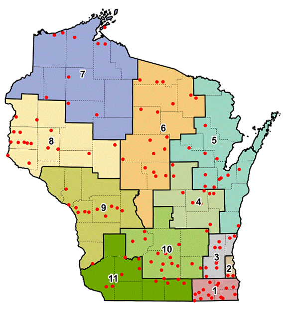
To ensure that our case studies spread across the entire state, we adopted the Wisconsin Workforce Development Board regional map. We had a variety of maps to choose from, but the bulk of recommendations from our UW Extension colleagues across the state pointed us to this map shown in Figure 1. The map is not perfect for our purposes. Regions 5 and 6, for example, have long north-south dimensions that do not correspond very well to Wisconsin's distinct up north region. This required us to adjust our method, as we will describe.
In our demographic analysis we created an initial "top 20 list" for gainers, and another for maintainers, in each region. To be considered a gainer, a place had to show an overall positive gain in young adult population from 1990-2010 (the median for communities in the state was a -22% loss). To be considered a maintainer, a place needed to have a proportional young adult population above the median of 24% for communities in the state. Consequently, not every region had 20 communities on each list.
Young Adults in Wisconsin Cities
The focus of this research was on rural and small communities. But we nonetheless learned some things about cities as well. First, as we looked for gainers and maintainers in each region, we were most surprised by region 2, the highly urbanized Milwaukee County, where only two municipalities actually saw an increase in the young adult population. In fact, while we worry about rural brain drain, Milwaukee County did the worst of any region of the state. Fewer than 10% of the municipalities in Milwaukee County showed young adult population growth of 20-39 year olds from 1990-2010. No other region in Wisconsin had such a low percentage of places experiencing young adult population growth. However, we must note that region 2 is made up of only one county and, if we compared county to county, we may find other counties in a similar situation.
Because we also had extra funding the first year of the grant, we were able to do some analysis on other more places. One of the most interesting results of this analysis is that, in medium and larger-sized cities, different five-year cohorts of young adults locate in cities differently. The youngest 20-24 year olds tend to cluster together in the city center. Each older cohorts is more likely to be more dispersed away from the city center. You can see the census maps for select cities in Wisconsin in Appendix A.
We initially looked for the "overlappers"—places that showed up on both top 20 lists. It then became clear how important up north would be in the analysis. Up north does not have one specific agreed upon southern boundary, but regardless of which boundary we used, we needed to go to extra lengths to identify case study communities. In region 7, for example, we could find no overlappers in the top 20 lists so we extended them 10 more spaces to top 30 lists in order to find our overlappers. And in regions 5 and 6 all of our overlappers were in the southern part of the regions, so we extended those lists as well. We then sought out advice from UW Extension educators across the state, asking them to look at the total list of places that were gaining young adults, or whose proportion of young adults was above the state median, and recommend potential case study communities. That produced a final list of 130 places shown by the red dots in Figure 1. All of these places were in the top 20 on at least one list and the top 30 on the other or were recommended by Extension educators even if in some cases they dropped below the maintainer median.
There are clear clusterings of communities shown on the map in Figure 1. Cities, as our case studies will confirm, become very important to rural areas with strong young adult populations. The Twin Cities metro area, Chicago, Milwaukee, Madison, and even smaller cities like Eau Claire, La Crosse, Stevens Point, and Janesville become part of a rural-urban symbiosis. Freeways are also important, and of course provide fast routes between rural places and cities. Many of the places listed are in Combined Statistical Areas (CSAs) and might technically be considered urban rather than rural. However, as we will see from our case studies, the residents of these places define them as quite separate and distinct from urban places. So we did not limit the inclusion of communities based on whether they might be in a CSA.
Based on the clustering we were seeing, we extended this analysis to look at all of the communities that met the strict gainer and maintainer criteria. In total there were 280 overlapped gainers and maintainers, shown in Figure 2. In this analysis including all of the communities meeting both criteria, it is clear how important freeways and cities are. The absence of communities up north in Wisconsin is striking and we will have more to say about that later.
Figure 2
Green dots represent all gaining/maintaining communities. Squares represent cities of 39,000+ people. Green squares are gaining/maintaining cities, and red squares within Wisconsin are non-gaining/maintaining cities.
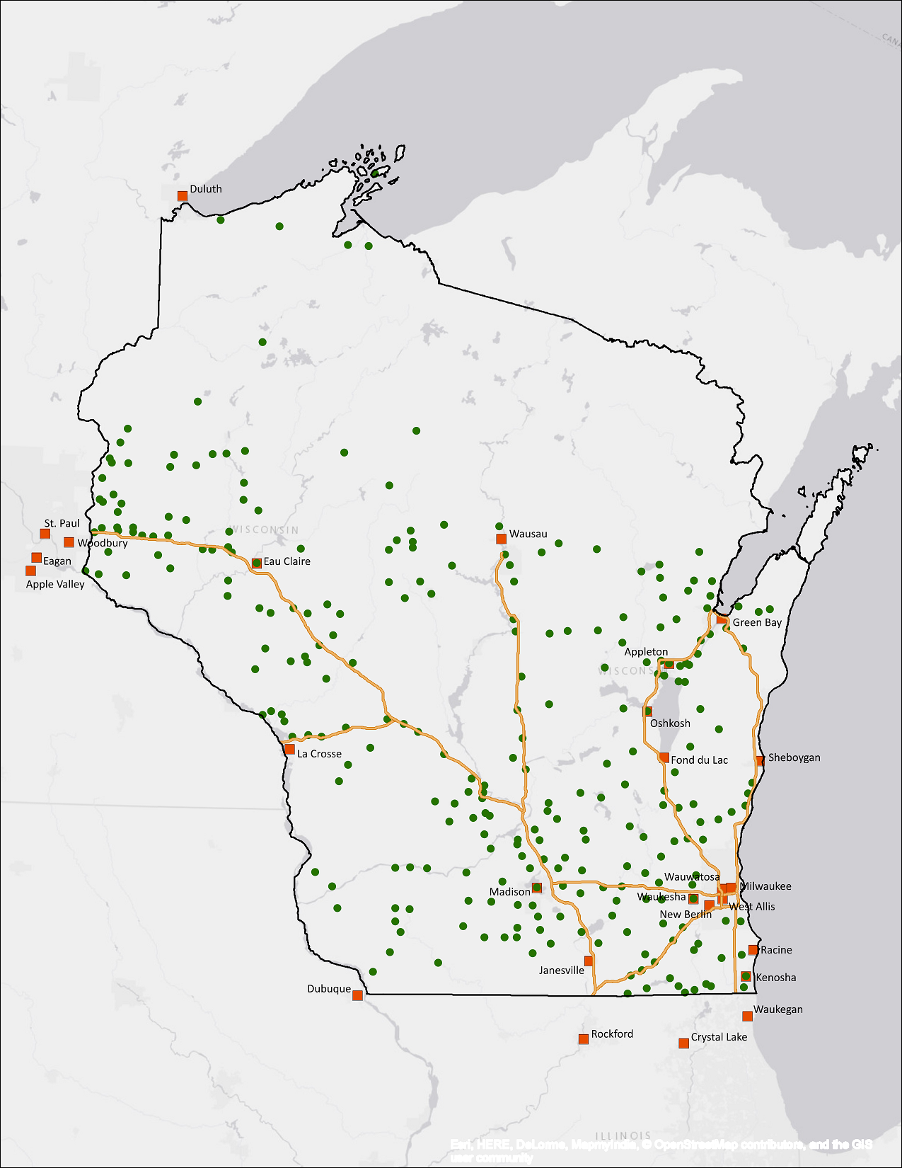
We also conducted a simple statistical analysis comparing these 280 communities to the 1600 places falling below our criteria. Table 1 shows the "as the crow flies" average distance between each group of communities and freeways or cities above 39,000 people. We chose freeways because we could see an obvious clustering in our very initial analyses. And we chose communities above 39,000 people because those were the places mentioned in our case studies, and when we went below that figure the list started including suburbs that would unnecessarily complicate the analysis.
| Gainers / Maintainers | Non-Gainers / Maintainers | |
|---|---|---|
| Count | 280 | 1600 |
| Average distance (miles) to freeway | 15.5 | 29.4 |
| Average distance (miles) to city >39,000 | 24.2 | 33.4 |
| Percent of communities within 20 miles of city >39,000 | 46% | 27% |
The difference in distances shown in Table 1 are as dramatic statistically as they are visually in Figure 2. The non-gainers/maintainers are nearly twice the distance from freeways as the 280 gainers/maintainers. They are nearly 10 miles further on average from larger cities. The average may be deceptive, since the up-north communities are much further from cities and freeways than communities in the south half of the state. But the measure of the percent of communities in each group within 20 miles of a city with more than 39,000 population also shows dramatic differences that are more likely to extend across the state.
Figure 3
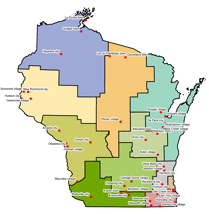
Our next step was to get to a manageable list of case study communities. We simply did not have the resources to do 130 case studies. So our goal was to identify a maximum of 15 places. In doing so, we were careful to treat each of our demographic measures qualitatively as well as quantitatively. For example, we looked at community size. For very small communities, proportions can change a lot with only small changes in numbers. In other cases, mergers or annexations may have artificially affected the numbers. We initially considered towns, but gradually excluded them, expecting that town expansions would be influenced by nearby municipalities. We also consulted Extension educators across the state to offer their appraisals of the municipalities in their county. This process reduced our list to 40 places, shown in Figure 3. We then gathered more information on each of these places, including industry mix, income, unemployment, education, racial diversity, and other qualitative information. We then conducted brief site visits in each place, with brief intercept interviews of local librarians, cafe counter workers, or wait staff. We also consulted again with the county Extension educators.
We were not looking for necessarily the "best" places, and such a judgment would have been arbitrary in any event. What we wanted was a diverse set of case studies. Our reasoning was that, if we found the same results across a diverse set of places, we could be even more confident in the validity of those results. We were careful to not concentrate on places that were too unique, however. We excluded places that were too influenced by a single large local industrial operation or military base, for example. At the same time, we were hoping to find some unique results that could be tied to the uniqueness of the place. The final list of case studies, with information showing some of their diversity, is shown in Table 2. Note that Region 2, Milwaukee County, is not included in this analysis as our second year funding did not support doing case studies in such a concentrated urban county.
| Region | Name | High School Graduates | Bachelors Degree | Mean Household Income | Median Household Income | Unemployed (16+) | In-Migration, 1990-2010, 20-39 year olds |
|---|---|---|---|---|---|---|---|
| 1 | Delavan | 82.3% | 16.2% | $53,852 | $48,199 | 8.0% | mixed |
| 3 | West Bend | 92.5% | 26.1% | $66,916 | $56,829 | 4.7% | yes |
| 4 | Omro | 89.0% | 18.0% | $51,211 | $44,375 | 4.6% | yes |
| 5 | De Pere | 95.5% | 34.5% | $69,220 | $56,834 | 4.5% | yes |
| 5 | Black Creek | 92.8% | 14.0% | $53,866 | $47,188 | 7.1% | yes |
| 6 | Plover | 90.0% | 31.0% | $58,409 | $67,765 | 7.3% | yes |
| 6 | Hayward | 86.4% | 19.7% | $41,725 | $27,100 | 5.3% | yes |
| 8 | Somerset | 92.4% | 22.4% | $61,412 | $62,115 | 6.5% | yes |
| 8 | New Richmond | 92.0% | 23.8% | $66,613 | $52,656 | 7.7% | yes |
| 9 | Onalaska | 94.8% | 35.7% | $75,789 | $53,813 | 3.8% | yes |
| 10 | Brooklyn | 96.1% | 25.3% | $79,982 | $77,250 | 5.8% | yes |
| 11 | Evansville | 95.6% | 24.2% | $68,319 | $58,571 | 3.1% | yes |
| Wisconsin | 90.8% | 27.4% | $64,523 | $52,738 | 4.9% | mixed |